We’re trying to enlarge the subscriber base for the ExhaustNotes.us website. Our marketing efforts so far have been focused on sharing links on Facebook and posting links on various chat sites. It’s a hit and miss method that works okay and you can boost sponsored posts from Facebook but an email subscriber list may work even better. A subscriber email list would be by definition readers who are interested in our content.
In their heyday motorcycle magazines used to give away all sorts of cool gear plastered with logos. It built loyalty in an era when motorcyclists had many magazines to choose from. Today, with the zillions of websites to choose from will that kind of marketing work again?
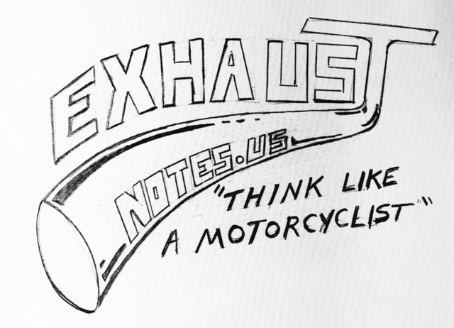 I guess we’ll find out. The first rough draft of the exhaustnotes.us sticker was a simple design using the popular, exhaust-pipe-streaming-off-a-letter style. This is not a new innovation but then neither is a motorcycle blog. The design needed to work with T-shirts and other future swag projects. We wanted it hand-drawn because Berk and I are old school and we are not wasting your time trying to appear otherwise.
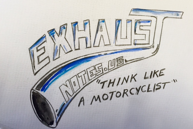 Next we applied a little color to the design, not too much to keep costs down later on in the life of the logo. The chrome reflections and sky blue harken back to the Cycletoons/Cartoons magazines we read as whelps.
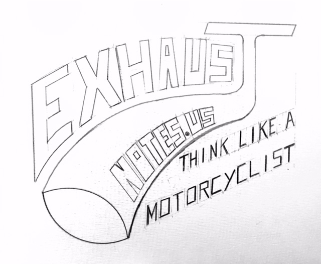 After we agreed on the layout the design was tightened up. The “E” fitted to the pipe better and the pipe was fatter and curved down more. We eliminated quotation marks on the motto and straightened out the lettering a bit.
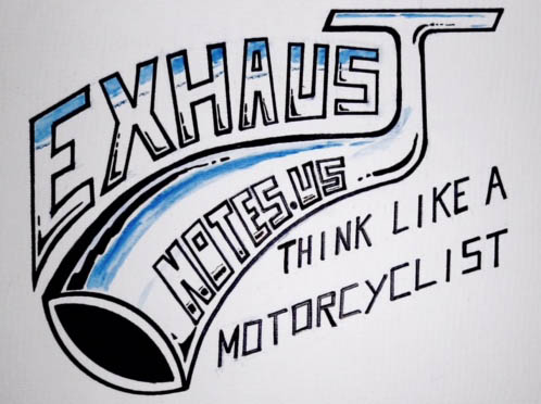 Now the real work began: Inking the outlines and making every bold line pop out. We needed to make the design strong enough to survive shrinking in size or enlarging. A cheerful children’s watercolor set brightened things up without being hard to duplicate on clothing, stuff bags or tramp stamps.
 The final design was sent to www.JimmyMacDesigns.com for more refining, clean up and changing the whole jpeg mess into a vector file to prevent loss of data when resizing. Jimmy is a true artist. Go to his website to check out his fantastic metal and wood creations. You won’t be able to tell from these low-res blog photos but Jimmy got rid of all the tooling marks, made the letter edges sharp and resorted them to be more even without losing the hand-drawn look. He also made it fit into a standard oval sticker and added a ragged outside line on the oval.
Here’s the deal: Sign up for ExhaustNotes.us email alerts and using a well-regulated yet self-funded government letter carrier we’ll send a brand new sticker suitable for framing to you for your effort. Just like in the old days except you don’t have to cut out box tops or coupons and crap. We only have a limited number of these to give away so you’ll need to get on the list before January 1st, 2054. You can email your snail mail address to Berk or me at info@ExhaustNotes.us after signing up. Sure, it’s a clunky process that will take a few weeks, but this is ExhaustNotes.us. If you want smooth and professional you should subscribe to the real magazines.

Love your site. Please send me your new sticker. It will look great on my RX3. Keep up the great work
STICKERS! I love the sticker concept. I lost my original green Cycle duffel bag somewhere back in the late 70’s……..
I emailed and am waiting by my snail mail box…did you send it yet? It has been 5 minutes…let me go check my mail again…. nope not here yet…
I just replayed to the “Sticker Shock” email, anxiously awaiting my just rewards!
I dig the stories too btw, you guys do a great job. I sure wish you would’ve taken be to Baja with you though.
Thanks, Mark. We were just talking the other about the possibility of a staff Baja ride. Keep an eye on the blog. If I can teach Gresh how to ride a motorcycle without doing burnouts we may just do that.